An Infographic for Design Media, 2013

An Infographic for Design Media, 2013
I’ve been working on this for weeks, but I finally needed to start getting stuff organized since I have so much information spread out all over the place and I’m going to need to be citing sources, etc.
I started my research with a basic question: “How can deaths from drunk driving be prevented?”
Fortunately, a research topic on this had already been done by the CDC and I was able to pull their fact sheet here which detailed a lot of what I was going to need for my infographic. They also cite all of their sources, so instead of citing them I’ll be citing their original sources, since that’s more reliable.
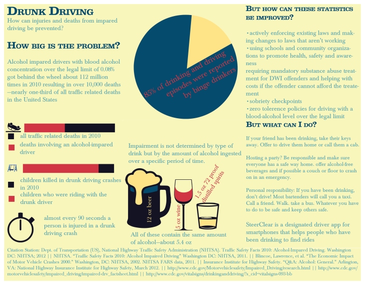
I’ve worked with a couple of layouts and I don’t know if I want to use table charts or pie charts. people seem to be able to pull more information more quickly from pie charts so I’ll probably go with that. I have my grid structure set up and a few ideas for different color palettes but I’ve been playing with them and I’m still not decided between these three:
The first is the most dramatic, but I’m leaning more toward the last one. It’s subdued and kind and it’s a sensitive subject and I don’t want people to be driven away by the colors. I want them to feel affected and empowered but also sobered (no pun intended) and blue is a calming color but also tends to invoke sadness sometimes. The yellow blends in as a nice background color avoiding white and doesn’t clash with the blue and will also provide subtle highlights. I might bring in another color for emphasis from one of the other two palettes if I settle on the third one. I’m not sure yet.
I found a great quote, even though it’s probably out of context, it’s still witty and adds some levity to a grave situation:
I have a lot of information here and a lot of little pictograms to organize and I need to get back to work, I just wanted to start cataloging sources.
I really want to make a pie chart comparing some things but I’m having a hard time coming up with related statistics that could go well in a pie chart so if anyone has anything (Please include a source for the statistic) that’s from 2010 or more recent, please leave a comment so I can include it. I want a big pie chart in the middle of the graphic and I have the perfect place for it. Thanks for reading!
>>>”Sobriety checkpoints reduce alcohol-related crashes
>>>>A systematic review conducted by CDC researchers on behalf of the Task Force on Community Preventive Services concluded that sobriety checkpoints reduce alcohol-related crashes. Sobriety checkpoints are traffic stops where law enforcement officers systematically select drivers to assess their level of alcohol impairment. The goal of sobriety checkpoints is to deter alcohol-impaired driving by increasing drivers’ perceived risk of arrest. Results indicated that sobriety checkpoints consistently reduced alcohol-related crashes, typically by about 20 percent. The results were similar regardless of how the checkpoints were conducted, for short-term “blitzes,” or when checkpoints were used continuously for several years. This suggests that the effectiveness of checkpoints does not diminish over time.
Related Articles
Guide to Community Preventive Services. Reducing alcohol-impaired driving: sobriety checkpoints. [cited 2009 Nov 3]. Available at URL: http://www.thecommunityguide.org/mvoi/AID/sobrietyckpts.html
Elder RW, Shults RA, Sleet DA, Nichols JL, Zaza S, Thompson RS. Effectiveness of sobriety checkpoints for reducing alcohol-involved crashes. Traffic Injury Prevention 2002;3:266-74.


